| | I don't just match paint colours... I now match pumpkins too. This was completely unintended, but it's the coolest thing! I found some great specialty pumpkins at a local market the other day, and this colour instantly caught my eye. A couple of them standing out against the bright orange and cream of the other ones. Little did I know, I've used this colour before - my front door! If you are wondering, my front door is painted in Benjamin Moore's Aura Exterior Low Lustre finish, in the colour Heather Gray. I love fall decorating, the bright colours against muted backgrounds really play with the eye! Anyone else find themselves unintentionally matching colours? |
|
3 Comments
Spring has almost been here for a month now, but the weather really hasn't been very spring like. It's been cold, windy and this weekend freezing rain and snow. Let's hope the weather turns around soon so exterior projects can begin!
I've been busy with a few refinishing projects that have kept me inside in the warm! Check them out under the "For Sale" tab. I refinished a gorgeous antique side table, in a neutral grey that would work with any colour scheme. The other, a nice Bombay console table refinished in Benjamin Moore's Gentleman's Gray! Hope everyone stays warms today! ...I'm off to cover my Allium bulb's leaves, before they freeze. Hey Everyone!
I hope you enjoy the newly refreshed website. It was long overdue, but is finally starting to come together nicely. There are new updated images, along with a list of our new services * whisper voice * .. I am now starting to refinish furniture. There are many before & afters under the Portfolio tab, including rooms and furniture pieces. Today is the first day of spring, and what does that mean? Soon enough it will be exterior season! Contact me if you would like to set up a date for an exterior colour consultation. Remember, to paint outside, the temperature needs to be above 4C for 30 days! Otherwise, the paint won't cure properly and may flake off next winter. Exterior painting season is typically from May long weekend to September long weekend. Exterior painting season is in full swing and what better way to quickly update your curb appeal by changing the colour of your front door! Some great choices for front door colours are as followed: Benjamin Moore: Vintage Wine 2116-20 - great for any colour type of siding Hale Navy HC-154 - perfect for red, cream or grey colour type of siding Iron Mountain 2134-30 - an all around nice charcoal grey without pulling out blue tones Night Horizon 2134-10 - rich, warm and inviting a perfect colour to pair up with a lighter coloured siding Caliente AF-290 - that perfect red that will compliment any front door area 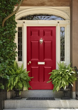 Picture shown is in the colour Caliente AF-290 It's been awhile! Warmer weather is upon us, and many people are wanting to start getting projects done before the summer hits. People are cleaning, updating and freshening up their spaces so that they can enjoy the lovely weather inside after the longest winter we have had in a long time.
Benjamin Moore has come out with their 2004 Colour Trends, which includes a lovely fresh blue colour representing the colour of the year. "Breath of Fresh Air" 806 will brighten any space, and bring that lovely outdoors feel in. Match it with a beautiful grey-beige linen bedspread and deep purple accents, would really make a space feel inviting, fresh and add a sense of inspiration to your day. Check out the colour palette for 2014 through this link: http://www.benjaminmoore.com/en-ca/for-architects-and-designers/colour-trends-2014 Now that the temperature is dropping at night, interior painting and decorating is coming back into season! Contact me to book your whole home colour consultation before the holidays fast approach.
Hope you are having a great weekend! Check out my Portfolio page to see pictures from the Everything Baby and Tots Show!
A side note - if anyone is interested in the painting above the crib please contact me, as well as the decorative giraffe or mirror window frame (shutters open). Hi Folks!
Been forever since my last blog, been just so busy lately. Have some cool news! I have been asked to do the Dream Nursery for a Baby Trade Show in Barrie, ON. Come check it out! Everything Baby and Tots Show - May 4-5 East Bayfield Arena (behind Georgian Mall) Barrie, ON Also, there will also be a silent auction table at the event where I will be donating a 'free nursery consultation.' All proceeds go to the Women's and Children's Shelter of Barrie. The reason why everyone is drawn to the pieces of Restoration Hardware is just that of the name of the company, restored pieces that look vintage, worn/used, including upholstery textiles, metals, and wood.
A lot of the pieces on Restoration Hardware can be achieved by just keeping your eye open for deals at local decor stores, vintage shops, second-hand stores, or even the side of the road. Palette tables with large industrial metal wheels, oversized sofas with tufted backs, buttons, and castor feet, metal lighting solutions and antiqued pieces for an antique cost. Pottery barn has a lot of similar pieces but are less expensive. There are tons of boutiques in small towns that have wonderful pieces that are not as expensive as well. Even greating your own pieces will save you a lot of money. Mentioned earlier, palettes are a big deal right now and by sanding them down smooth and staining/painting/or using a clear coat on them will give them a durable finish that can be used on a daily basis as a table (just add wheels), a cool bookshelf or even a unique headboard/bed frame that is on the ground. Sand painted surfaces, rub metal surfaces, oil leather to darken it....there are tons of different techniques to create that Restoration Hardware look. Just keep your eyes peeled and you will see those pieces that can be fixed up, save you money, and create that dream home you've always wanted! It's always nice to make a new space feel like it has been lived in. Helps make it feel warm and inviting, instead of new, stark and clean. By adding textures with colours, fabrics and accessories can help make a space feel more inviting for someone visiting. 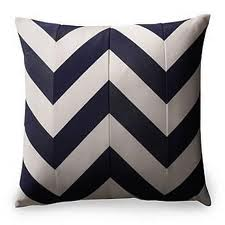 Chevron designs are very popular right now for accessories, and accent walls. It is a great way to pull colours for other accessories and to base your design around. Modern but still traditional with the clean lines and bright colours, the chevron design will stay around for awhile. 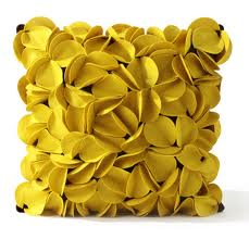 Texture, texture, texture! Not only is this colour fabulous for adding the punch to a room, the fabric and texture within the pillow creates a dynamic feel. 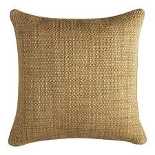 This type of texture will always stay classy in any type of space be it modern, traditional, country-rustic, coastal etc. That sutle amount of texture plays with your eye and creates the depth you want on your bed, sofa, or chair. 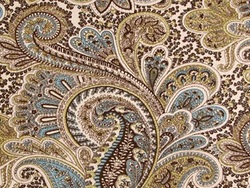 Paisleys are also very popular, especially if it has many different neutral colours and a pop of another colour. Also, great to base your design around as you can pull numerous of different colours from it that can unify a space. |
Have a topic or Interior Decorating question for us? Email us and we will blog about it!Archives
April 2018
CategoriesCollective Designs Copyright © 2013
|
